Learning any new skill is hard. There are too many possibilities, and the goal seems massive and intimidating.
Enter the Pareto Principle.
The Pareto Principle, also known as the 80/20 rule, suggests that 80 percent of results come from 20 percent of efforts. It can be applied to everything from business to language, even learning how to use R.
With just a few packages and commands, you can get a lot done. The rest is just practice. Here are a few topics you can focus on to learn, and let’s make it interesting by using some National Football League data.
Data Manipulation
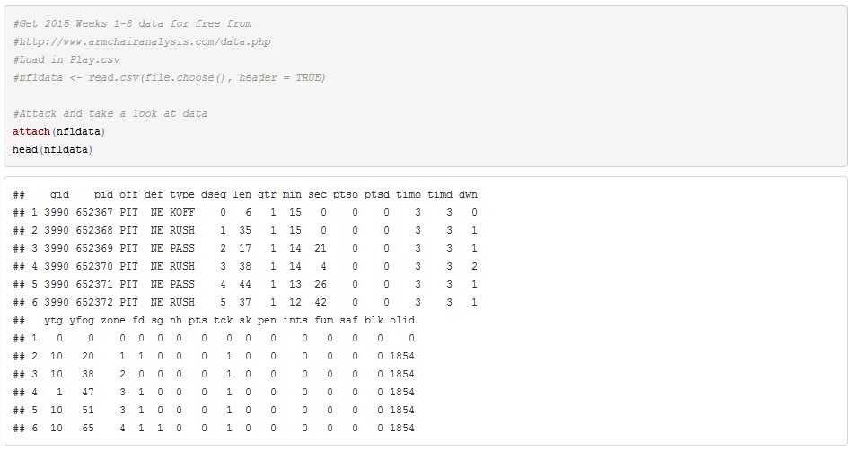
To start off, I downloaded RStudio here and the dataset here. The data contains every NFL play from the first half of this season. Here’s what the data looked like after importing it into R.
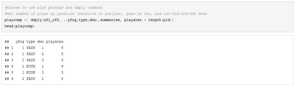
I want to see how teams choose to either run or pass at different yard lines on the field. In order to do that, I’ll have to shift my data frame, essentially create a pivot table in R. For that, I’ll use the “plyr” package to count the type of each play by yard line.
Data Visualization
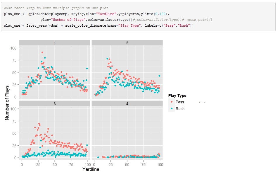
Now that the data is set up correctly, I want to see the data in a graph. I’ll use “ggplot2” which is one of the most well-known packages in R. We’ll use a basic plot, but with a little twist to separate which down the play was. In looking at the graph, we can see how play calling changes from 1st down to 3rd down.
Presentation
Now that you have found something interesting, you need to present it. R Markdown (see here) allows you to create HTML style pages that can even be published on the web. In fact, I used R Markdown in creating this post.
In summary, data analysis skills are near the top of every employer’s wish list. They may seem difficult, but in fact are quite attainable with practice. Don’t be intimidated, and never stop learning.
Note: The code for this post can be found here.