After data science, which I discussed in this post, data visualization is one of the most common buzzwords thrown around in the tech and business communities. To demonstrate how one can actually visualize data, I want to use one of the hottest tools in the market right now: Tableau. You can download Tableau Public for free here, and the “Cat vs. Dog” dataset can be found here. Let’s get started.
1. Play around with the data and find what looks interesting.
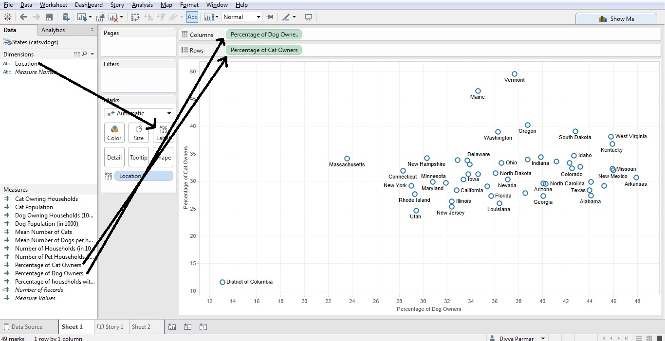
I was curious to see if there was relationship between the rate of cat ownership and dog ownership. So I put dog ownership on the x-axis and cat ownership on the y-axis; I then added the location dimension as a label. All of this is done through simply dragging and dropping, and this gives you an easy starting point.
2. Add some elements as necessary to show your insight.
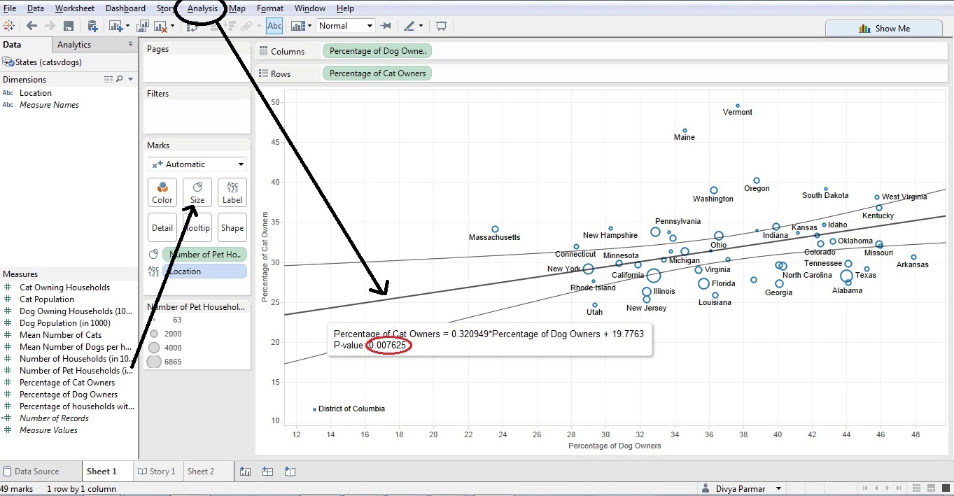
There are many ways to build on the preliminary step. You can add something like a trend line to demonstrate a statistical relationship, which satisfies the “so what” part of the analysis (note the p-value is provided for the trend line). You can even give different colors or sizes to different data points, as we have done below using the number of pet households for each state.
3. Fix and improve to make usable for export, presentation, or other purpose.
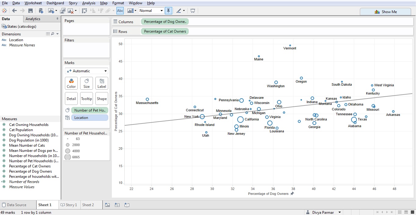
Data visualization is only useful if it is simple and to the point. In the above example, the District of Columbia data point is an outlier that is making the rest of the graph harder to read. You can remove that point, and can also remove the confidence bands for the trend line if that is too messy.
Hope this has been helpful. Go forth, get data, and visualize.