This month, I set out to do weekly analysis based on different datasets. For this week, I chose presidential primary polling data from FiveThirtyEight.
First, I filtered for Democratic polls in the last month.
dems = polls[polls$party == ‘DEM’ &
as.Date(polls$start_date, “%m/%d/%y”) >= as.Date(‘2019/03/11’) &
polls$state ==”” &
polls$candidate_name %in% c(“Bernard Sanders”,”Elizabeth Warren”,”Joseph R. Biden Jr.”,”Pete Buttigieg”,
“Beto O’Rourke”,”Cory A. Booker”,”Kamala D. Harris”,”Andrew Yang”,”Amy Klobuchar”,”Kirsten E. Gillibrand”,”Howard Schultz”),]
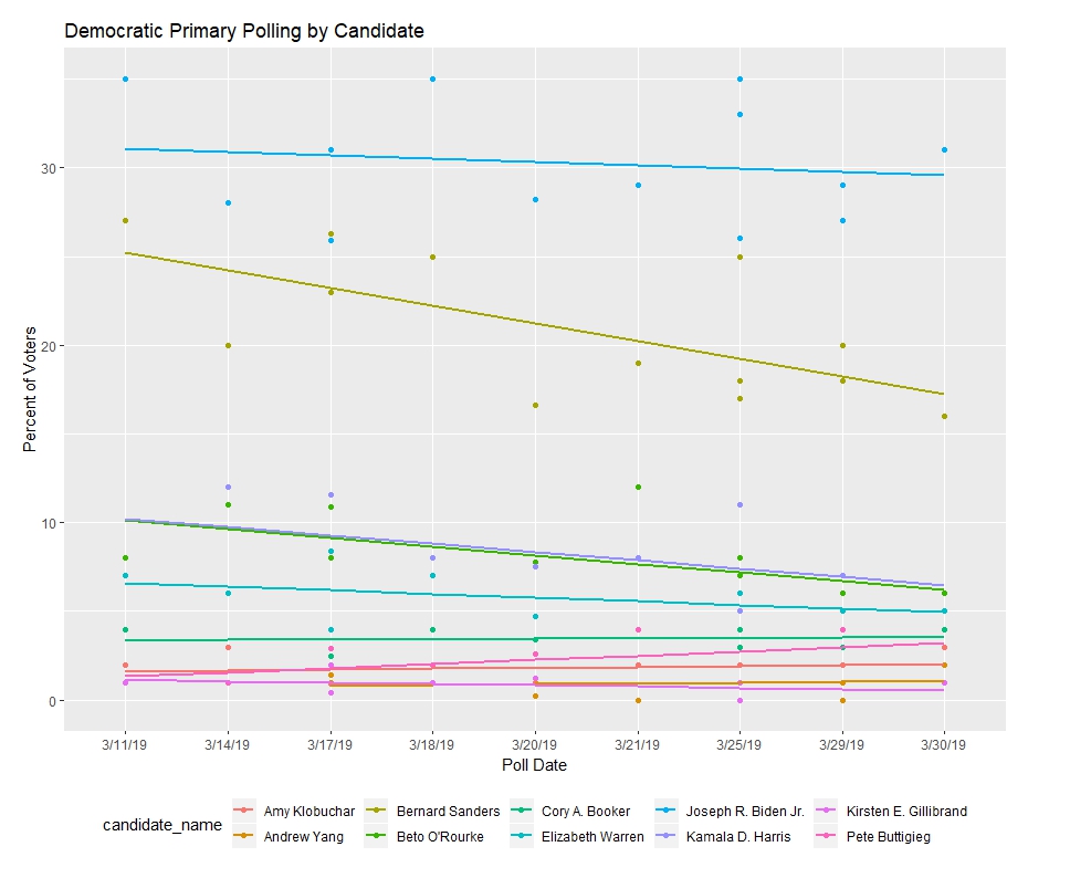
Then I plotted each candidate’s individual results and trends over the period of polls.
ggplot(dems, aes(x=start_date, y=pct, group= candidate_name, color = candidate_name)) +
geom_point() +
stat_smooth(method = ‘lm’, se = FALSE, show.legend = TRUE,inherit.aes = TRUE) +
scale_colour_discrete(guide = ‘legend’) +
theme(plot.margin = unit(c(1,3,1,1), “lines”)) +
labs(x=”Poll Date”,y=”Percent of Voters”, title = “Democratic Primary Polling by Candidate”)
With that, I obtained this plot.

We can see that Joe Biden, although he’s not officially in the race, has been the front runner with Bernie Sanders right behind him. The second tier has Kamala Harris and Beto O’Rouke, while the third tier has Elizabeth Warren and Cory Booker.
That’s all for this week, on to new analysis next week.