This month, I set out to dive deeper into my dataset and Tableau dashboard from last month. Ultimately, I ended up going with this option from the list of “potential analysis” topics:
Compare voting behavior in 2016 versus 2018 (segment by youth vote, senior vote, high income vote, etc)
First I defined age (18-29, 30-44, 45-64, 65+) and income (<50k, 50-100k, 100k+) groups.
combined$age_bucket_2018 >= 18 & combined$age_rounded <= 29) ~ ’18-29′, (combined$age_rounded >= 30 & combined$age_rounded <= 44) ~ ’30-44′, (combined$age_rounded >= 45 & combined$age_rounded <= 64) ~ ’45-64′, (combined$age_rounded >= 65) ~ ’65+’,
combined$age_rounded < 18 | is.na(combined$age_rounded) | !is.numeric(combined$age_rounded) ~ ‘Other’
)
combined$zip_code_income_bucket (combined$income_rounded <= 49) ~ ‘<50k’, (combined$income_rounded >= 50 & combined$income_rounded <= 99) ~ ’50-99′, (combined$income_rounded >= 100) ~ ‘100k+’,
combined$income_rounded <= 0 | is.na(combined$income_rounded) | !is.numeric(combined$income_rounded) ~ ‘Other’
)
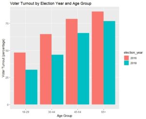
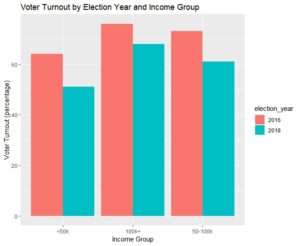
Then I used the CrossTable function (from gmodels) to go pull voting percentages across segments. In looking at the output, we find that young and lower income voters have steeper drop offs from general elections to midterms than do older and higher income voters.
#CrossTab for voting by age bucket in 2016 and 2018
CrossTable(combined$age_bucket_2016, combined$voted_2016_general_flag) #48%, 65%, 79%, 86%
CrossTable(combined$age_bucket_2018, combined$voted_2018_general_flag) #32%, 46%, 66%, 77%
#CrossTab for voting by income bucket in 2016 and 2018
CrossTable(combined$zip_code_income_bucket, combined$voted_2016_general_flag) #64%, 73%, 76%
CrossTable(combined$zip_code_income_bucket, combined$voted_2018_general_flag) #51%, 61%, 68%


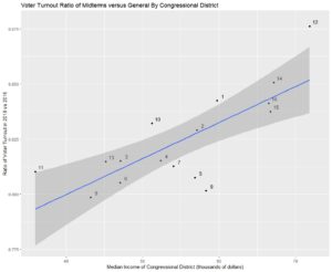
Then I obtained the median income for each congressional district, and I joined it to “midterm maintenance rate” (ratio of midterm turnout to general election turnout) by district.
cong_district_voting_2016 = CrossTable(combined$CONGRESSIONAL_DISTRICT, combined$voted_2016_general_flag)$prop.r
cong_district_voting_2018 = CrossTable(combined$CONGRESSIONAL_DISTRICT, combined$voted_2018_general_flag)$prop.r
cong_voting_ratio = cong_district_voting_2018/cong_district_voting_2016
ohio_voting_change_and_income = cbind(cong_voting_ratio, ohio_congressional_district_median_income)
ggplot(data=as.data.frame(ohio_voting_change_and_income), aes(x=median_income, y=voting)) +
geom_point() +
geom_text(label=1:16, nudge_x = 0.75, nudge_y = 0.002, check_overlap = TRUE) +
geom_smooth(method=”lm”) +
labs(x=”Median Income of Congressional District (thousands of dollars)”,
y=”Ratio of Voter Turnout in 2018 vs 2016″,
title=”Voter Turnout Ratio of Midterms versus General By Congressional District”)
We find a clear linear relationship between a congressional district’s wealth and “midterm maintain rate” (ratio of midterm turnout to general election turnout) . Higher income districts have a lower drop off.

With that, I’m glad I was able to look into this data from a different angle. I look forward to touching new data sets next month.